Anupam Pareek
Lead Product & Game Design @ Rush Gaming Universe By Hike


Anupam Pareek
Lead Product & Game Design @ Rush Gaming Universe By Hike


Anupam Pareek
Lead Product & Game Design @ Rush Gaming Universe By Hike


Anupam Pareek
Lead Product & Game Design @ Rush Gaming Universe By Hike


Rush Core Experience ReDesign : Insights to Business Impact
Rush Core Experience ReDesign : Insights to Business Impact
Rush Core Experience ReDesign : Insights to Business Impact
It all started with Customer Acquisition Cost hitting all time high for Rush for consequitve months. To understand what's going on, we examined our data closely and observed substantial drop-off in the initial stages of user onboarding flow. Added concern was that a considerable portion of sign-ups didn't even engage in gameplay on Day 0.
This case study highlights our journey, insights, and the outcomes achieved through a revamped First Time User Centric Experience leading to significant business impact.
Problem Statement
Optimise core transactional flow of Rush app for better conversions at Top of the funnels & overall Retentions to reduce CAC.
Discovery
Data & insights
Within our design team, we have a steadfast practice of continuously monitor data and review the performance of our funnels. In doing so, we unearthed a worrisome truth –
App download to install ratio was on the borderline of averaging at 65%
Only 70% users finished our signup flow.
Staggering 30% of users who finished signup, failed to engage in any gameplay on Day 0
This posed a significant challenge as these users were missing out on core experience of the app – the thrill of playing games, winning real cash, and withdrawing their earnings.
Our data also demonstrated that users who made their first withdrawal exhibited superior retention rates on our platform
Armed with this vital insights and driven by curiosity, we embarked on a comprehensive investigation of the entire discovery flow : From the moment users landed on our website → APK download → Installation process → Signup flow → Core gameplay. Our exploration uncovered numerous friction points and alarming drop-offs, compelling us to undertake a meticulous design audit of the entire user journey.
Design Audit


During the UX audit, we organised a team meeting where all designers actively participated. Together, we compiled a comprehensive list of usability, UI, UX, and readability issues that required attention. Additionally, we discovered several areas where implementation was lacking in precision.
During the UX audit, we organised a team meeting where all designers actively participated. Together, we compiled a comprehensive list of usability, UI, UX, and readability issues that required attention. Additionally, we discovered several areas where implementation was lacking in precision.
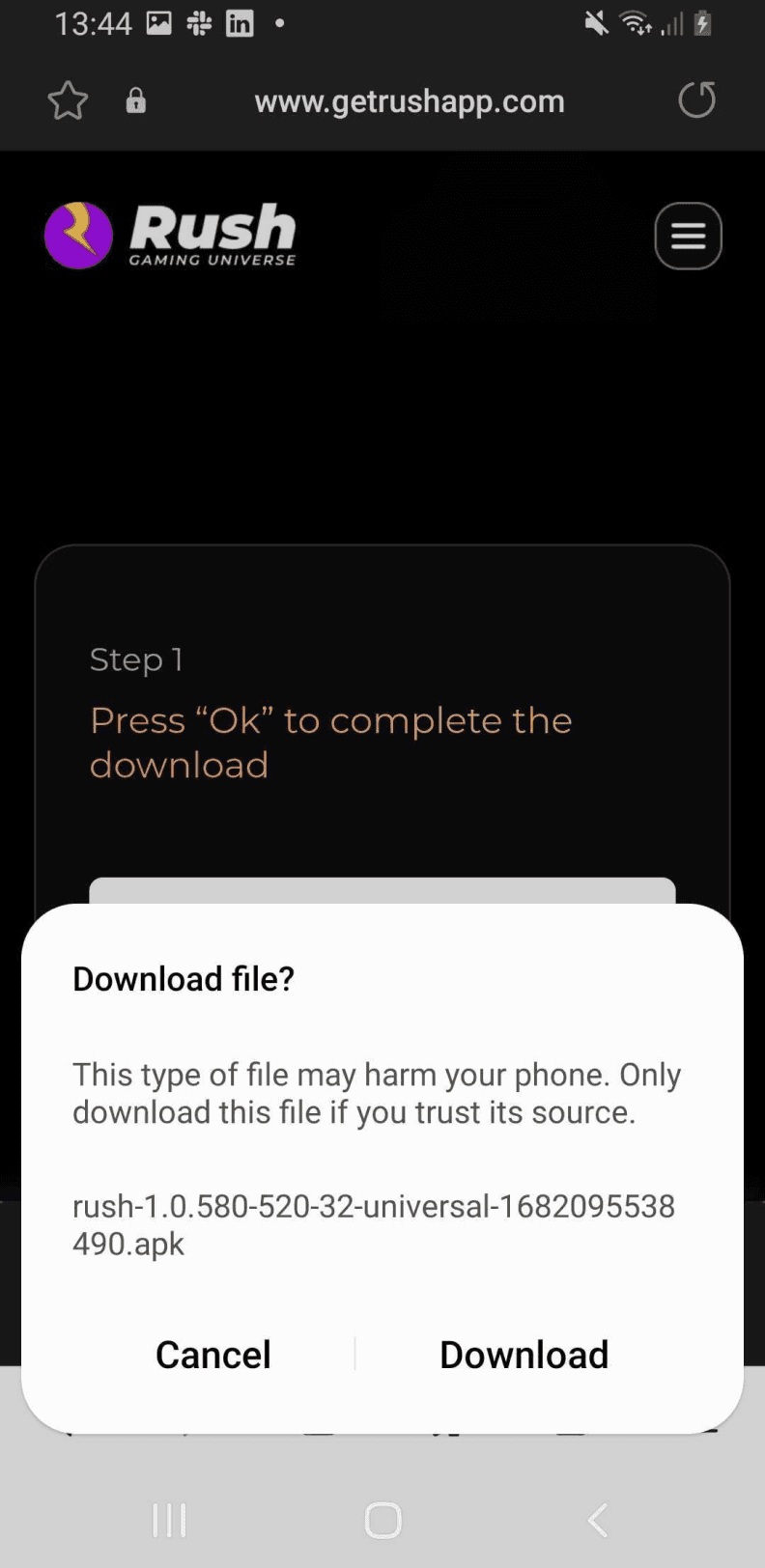

Our apk’s name didn’t look authentic.
Our apk’s name didn’t look authentic.


Using stock images on signup screen, no touch of brand
Using stock images on signup screen, no touch of brand
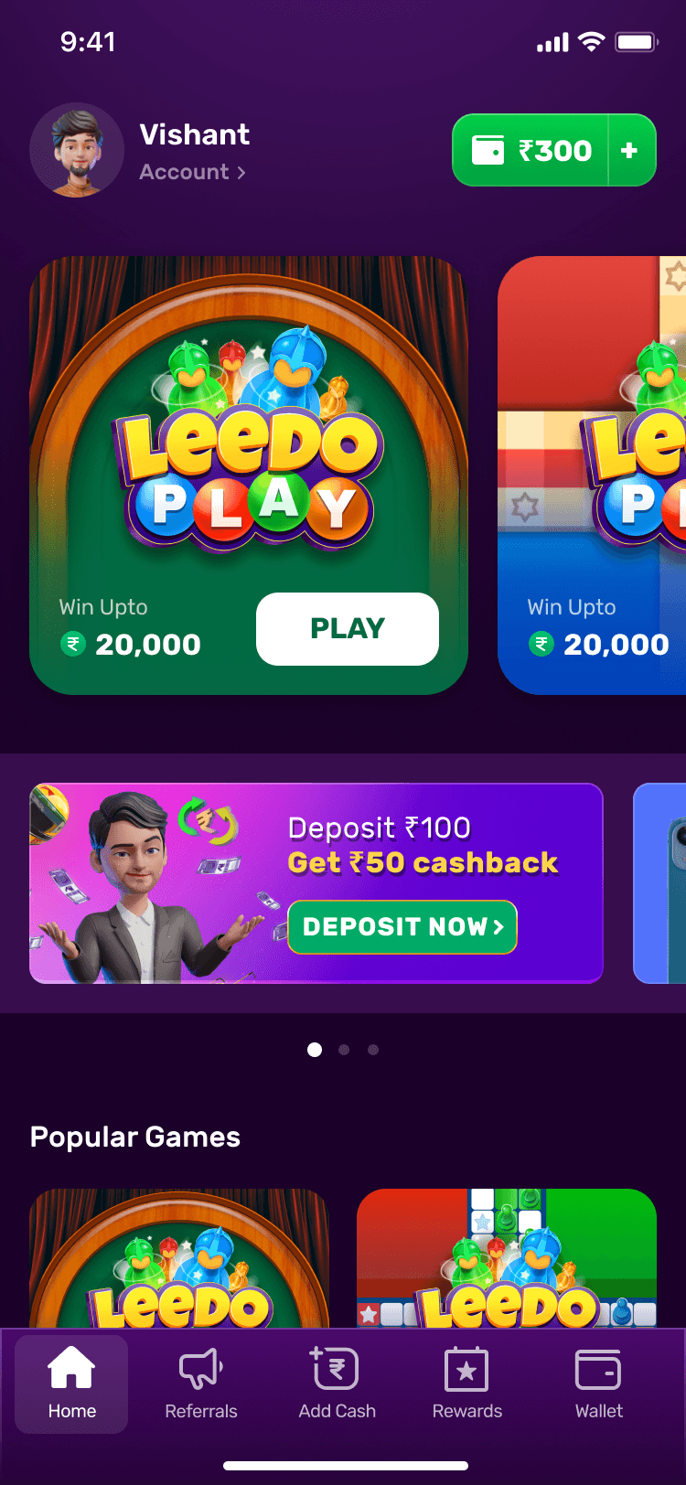

Too much going on the home screen for a new user
Too much going on the home screen for a new user
Some major discoveries in UX audit
🔴 Our core transaction flow was too stretched and loosely tied; leading to less users able to get the Aha moment hence lesser the conversions.
🔴 Inadequate explainer for APK installation, potentially making users doubt the app's authenticity due to nonsensical gibberish in APK name
🔴 Cluttered website with insufficient emphasis on download behaviour, causing confusion for users.
🔴 Lengthy install to signup flow with unnecessary taps and unappealing stock images on the home screen.
🔴 Overwhelming homepage with multiple games, banners, and marketing content, overwhelming our target audience. Our first time user experience was not stitched well, leading to low conversions and the fact that 30% of users were not even playing on Day 0.
Competitor Analysis
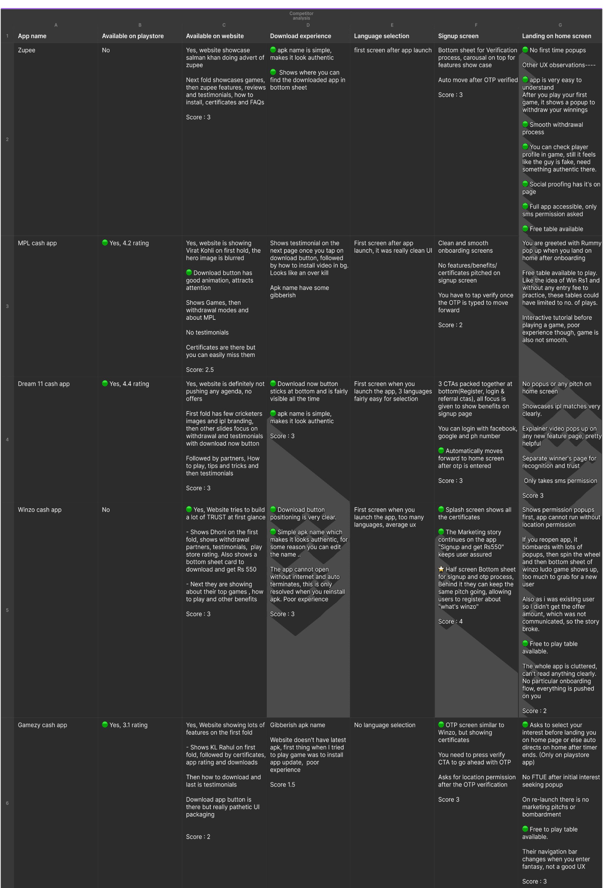
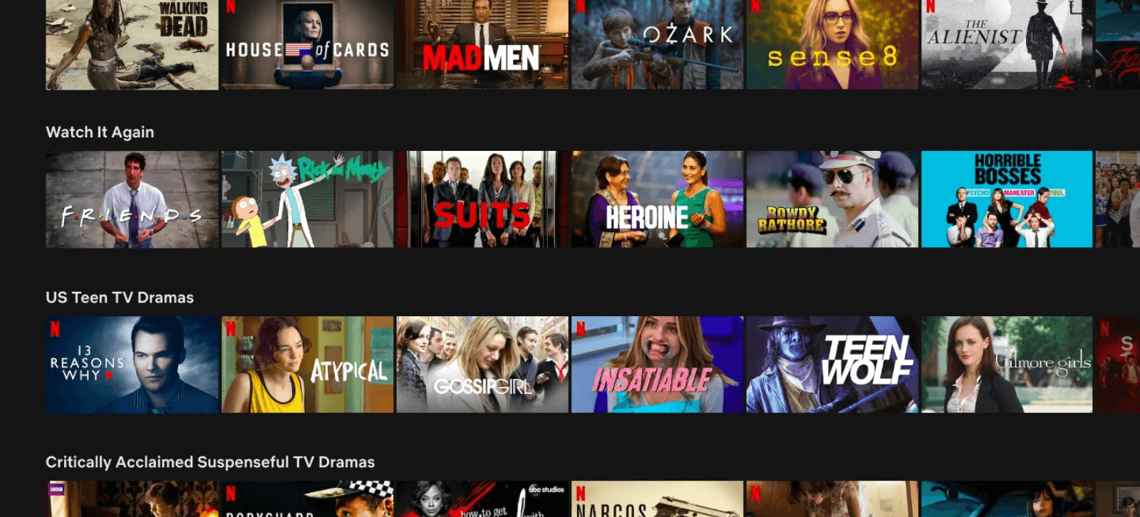
Before we wrote our feature’s story, it was important to check what stories are out there in market. Hence we looked at how our competitors were solving similar problems.



Design Storytelling & Wireframes


Design & Storytelling 🤝


Empathising with users is not only foundation of great UCX solutions but also very important to tell their story. In my experience, If you can tell the story of a user/feature/product, highlight the concerns, pain points and aha moments, you will come up with relevant solutions. The art of translating a story into tactics is what I feel the most fulfilling aspect of my career lately. For example let me tell you a story and then convert it into actionable tactics.
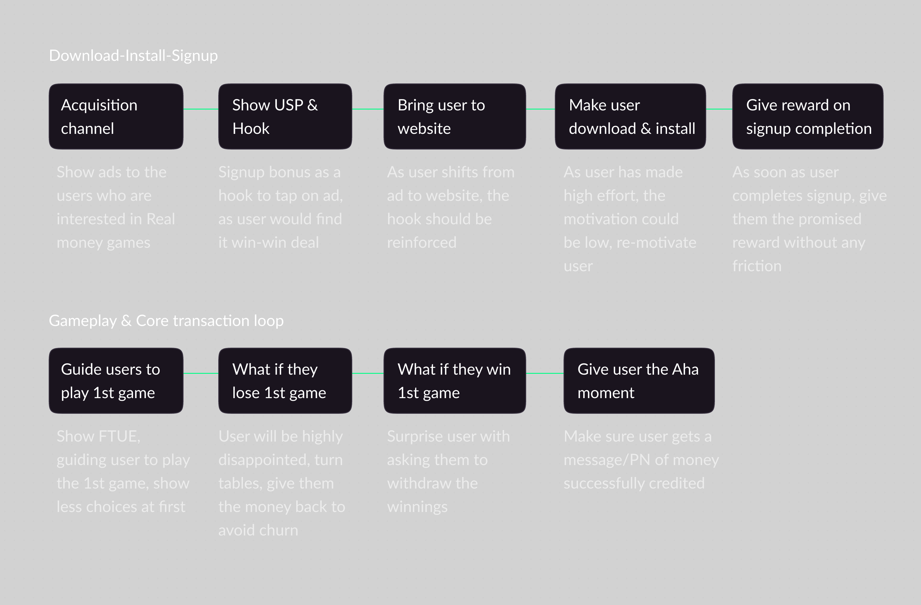
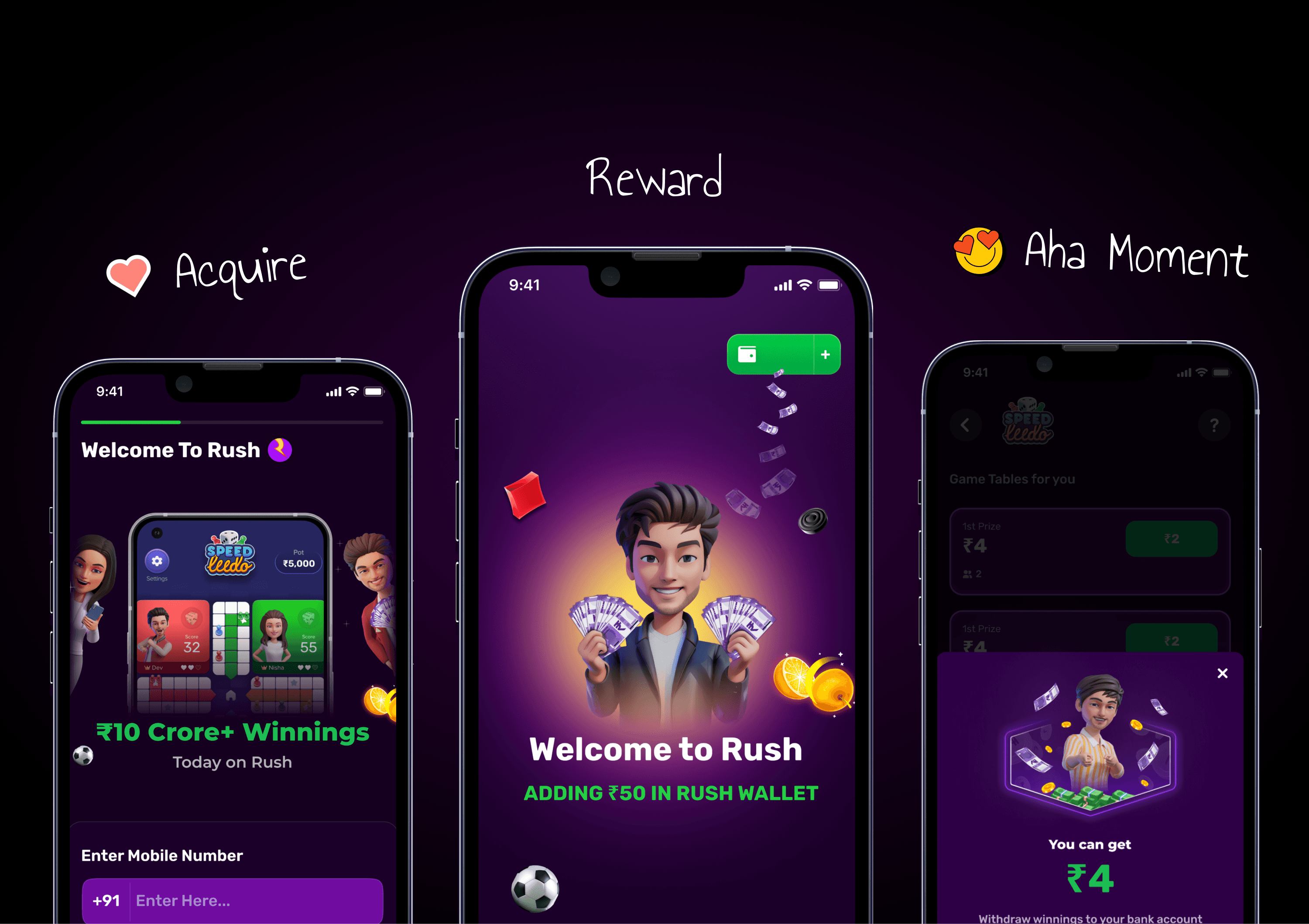
"One day, swiping through his facebook, Tim casually discovers the Rush app ad. Intrigued by the games and the opportunity to win money, he decides to give it a try. Reassured by the promise of a signup bonus, he eagerly downloads and installs the app. The signup process is a breeze, and Tim is welcomed with his promised bonus in a delightful animation. Next, the app nudges Tim with FTUE to play his first game, and even though he initially loses, the app offers him a second chance by returning the first match's entry fee. Tim tries again, wins, and app shows him an option to withdraw his winnings. Tim goes ahead, withdraws and a message pops up on his phone "Money Credited". A sense of trust is established, leaving him thrilled with his experience. Tim is now a Rush Player.
Now we just need to Design a flow which can bring this story to life without missing on the strong emotions exactly where they are in the story.

Wireframes
As per our design story & flows we designed the wireframes to stitch the end-to-end user journey. Not disclosing every screen in this case study :), contact me if you want deeper dive.


UI Design & Prototype
UI Design
One of our key strengths lies in having a robust Design Language System and comprehensive guidelines in place.
This invaluable resource streamlines the design process and enables us to swiftly create polished mockups that closely align with our envisioned final product. By leveraging our Design Language System, we can effectively showcase the app's features and design elements to stakeholders, UX research teams, and test users. This allows us to gather initial feedback at an early stage, ensuring that our design decisions resonate with users and meet their needs.
The efficiency and cohesiveness offered by our Design Language System not only save time but also contribute to the consistency and quality of the user interface, promoting a seamless and visually appealing user experience.
A/B Testing to 100% Rollout
Our approach involved executing a comparative analysis where we pitted our redesigned experience (the test flow) against the existing user journey (the controlled flow). Carefully considering the risk factors and to ensure the data's integrity, we introduced the test flow to a modest 5% of our user base during the first five days.
The results were encouraging from the outset.
🎉
5% Roll Out
7% improvement in the install-signup conversion funnel emerged. endorsing the redesigned website and the restructured FTUE journey's potential.
Spurred by these initial promising results, we proceeded with a phased rollout plan over the next 15 days, gradually raising the test flow's reach to 15% of our user base.
🎉
15% Roll Out
An exciting observation during this phase was the rise in the D0 gameplay metric, which spiked from 70% to an impressive 85%
We noticed a 1% increase in the D7 retention within the first few weeks of implementation
This substantial increase pointed to a much higher immediate engagement of our users with the platform's core offerings. Recognizing these substantial improvements in user behaviour metrics, we decided to accelerate our test flow distribution, expanding its reach to 50% of the total user base.
The metrics continued to portray an upswing trend, further validating our hypothesis about the redesigned website and enhanced onboarding flow's effectiveness. The ultimate validation arrived when the test flow outperformed the control flow consistently, compelling us to adopt it as the new norm.
🎉
Our Install & Signup flow are now our new control flows. As they performed 15% better conversions overall.
Our Post onboarding flow is still at 50% roll out with increased +5% D7 Retention, +18% D0 Gameplays & +4% User conversion on platform.
Reflection
This project underscored the importance of a user-centric approach in design. The shift in our strategy to a user-centric approach significantly improved our key metrics and proved that understanding and addressing user needs leads to business growth. The success of this redesign is driving a complete rethink of our app's UX, with a focus on leaner, more straightforward, and customer-first experiences.
This project underscored the importance of a user-centric approach in design. The shift in our strategy to a user-centric approach significantly improved our key metrics and proved that understanding and addressing user needs leads to business growth. The success of this redesign is driving a complete rethink of our app's UX, with a focus on leaner, more straightforward, and customer-first experiences.
THANKS FOR THE READ ✨
THANKS FOR THE READ ✨
Creating a successful game is an art that requires a keen understanding of player behaviour, design principles, and a careful balance between simplicity and engagement...FULL STORY ↗️
Creating a successful game is an art that requires a keen understanding of player behaviour, design principles, and a careful balance between simplicity and engagement...FULL STORY ↗️
Creating a successful game is an art that requires a keen understanding of player behaviour, design principles, and a careful balance between simplicity and engagement...FULL STORY↗️
Creating a successful game is an art that requires a keen understanding of player behaviour, design principles, and a careful balance between simplicity and engagement...FULL STORY↗️
Rush Core Experience ReDesign : Insights to Business Impact
It all started with Customer Acquisition Cost hitting all time high for Rush for consequitve months. To understand what's going on, we examined our data closely and observed substantial drop-off in the initial stages of user onboarding flow. Added concern was that a considerable portion of sign-ups didn't even engage in gameplay on Day 0.
This case study highlights our journey, insights, and the outcomes achieved through a revamped First Time User Centric Experience leading to significant business impact.
Problem Statement
Optimise core transactional flow of Rush app for better conversions at Top of the funnels & overall Retentions to reduce CAC.
Discovery
Data & insights
Within our design team, we have a steadfast practice of continuously monitor data and review the performance of our funnels. In doing so, we unearthed a worrisome truth –
App download to install ratio was on the borderline of averaging at 65%
Only 70% users finished our signup flow.
Staggering 30% of users who finished signup, failed to engage in any gameplay on Day 0
This posed a significant challenge as these users were missing out on core experience of the app – the thrill of playing games, winning real cash, and withdrawing their earnings.
Our data also demonstrated that users who made their first withdrawal exhibited superior retention rates on our platform
Armed with this vital insights and driven by curiosity, we embarked on a comprehensive investigation of the entire discovery flow : From the moment users landed on our website → APK download → Installation process → Signup flow → Core gameplay. Our exploration uncovered numerous friction points and alarming drop-offs, compelling us to undertake a meticulous design audit of the entire user journey.
Design Audit

During the UX audit, we organised a team meeting where all designers actively participated. Together, we compiled a comprehensive list of usability, UI, UX, and readability issues that required attention. Additionally, we discovered several areas where implementation was lacking in precision.

Our apk’s name didn’t look authentic.

Using stock images on signup screen, no touch of brand

Too much going on the home screen for a new user
Some major discoveries in UX audit
🔴 Our core transaction flow was too stretched and loosely tied; leading to less users able to get the Aha moment hence lesser the conversions.
🔴 Inadequate explainer for APK installation, potentially making users doubt the app's authenticity due to nonsensical gibberish in APK name
🔴 Cluttered website with insufficient emphasis on download behaviour, causing confusion for users.
🔴 Lengthy install to signup flow with unnecessary taps and unappealing stock images on the home screen.
🔴 Overwhelming homepage with multiple games, banners, and marketing content, overwhelming our target audience. Our first time user experience was not stitched well, leading to low conversions and the fact that 30% of users were not even playing on Day 0.
Competitor Analysis
Before we wrote our feature’s story, it was important to check what stories are out there in market. Hence we looked at how our competitors were solving similar problems.


Design Storytelling & Wireframes

Design & Storytelling 🤝

Empathising with users is not only foundation of great UCX solutions but also very important to tell their story. In my experience, If you can tell the story of a user/feature/product, highlight the concerns, pain points and aha moments, you will come up with relevant solutions. The art of translating a story into tactics is what I feel the most fulfilling aspect of my career lately. For example let me tell you a story and then convert it into actionable tactics.
"One day, swiping through his facebook, Tim casually discovers the Rush app ad. Intrigued by the games and the opportunity to win money, he decides to give it a try. Reassured by the promise of a signup bonus, he eagerly downloads and installs the app. The signup process is a breeze, and Tim is welcomed with his promised bonus in a delightful animation. Next, the app nudges Tim with FTUE to play his first game, and even though he initially loses, the app offers him a second chance by returning the first match's entry fee. Tim tries again, wins, and app shows him an option to withdraw his winnings. Tim goes ahead, withdraws and a message pops up on his phone "Money Credited". A sense of trust is established, leaving him thrilled with his experience. Tim is now a Rush Player.
Now we just need to Design a flow which can bring this story to life without missing on the strong emotions exactly where they are in the story.

Wireframes
As per our design story & flows we designed the wireframes to stitch the end-to-end user journey. Not disclosing every screen in this case study :), contact me if you want deeper dive.

UI Design & Prototype
UI Design
One of our key strengths lies in having a robust Design Language System and comprehensive guidelines in place.
This invaluable resource streamlines the design process and enables us to swiftly create polished mockups that closely align with our envisioned final product. By leveraging our Design Language System, we can effectively showcase the app's features and design elements to stakeholders, UX research teams, and test users. This allows us to gather initial feedback at an early stage, ensuring that our design decisions resonate with users and meet their needs.
The efficiency and cohesiveness offered by our Design Language System not only save time but also contribute to the consistency and quality of the user interface, promoting a seamless and visually appealing user experience.
A/B Testing to 100% Rollout
Our approach involved executing a comparative analysis where we pitted our redesigned experience (the test flow) against the existing user journey (the controlled flow). Carefully considering the risk factors and to ensure the data's integrity, we introduced the test flow to a modest 5% of our user base during the first five days.
The results were encouraging from the outset.
🎉
5% Roll Out
7% improvement in the install-signup conversion funnel emerged. endorsing the redesigned website and the restructured FTUE journey's potential.
Spurred by these initial promising results, we proceeded with a phased rollout plan over the next 15 days, gradually raising the test flow's reach to 15% of our user base.
🎉
15% Roll Out
An exciting observation during this phase was the rise in the D0 gameplay metric, which spiked from 70% to an impressive 85%
We noticed a 1% increase in the D7 retention within the first few weeks of implementation
This substantial increase pointed to a much higher immediate engagement of our users with the platform's core offerings. Recognizing these substantial improvements in user behaviour metrics, we decided to accelerate our test flow distribution, expanding its reach to 50% of the total user base.
The metrics continued to portray an upswing trend, further validating our hypothesis about the redesigned website and enhanced onboarding flow's effectiveness. The ultimate validation arrived when the test flow outperformed the control flow consistently, compelling us to adopt it as the new norm.
🎉
Our Install & Signup flow are now our new control flows. As they performed 15% better conversions overall.
Our Post onboarding flow is still at 50% roll out with increased +5% D7 Retention, +18% D0 Gameplays & +4% User conversion on platform.
Reflection
This project underscored the importance of a user-centric approach in design. The shift in our strategy to a user-centric approach significantly improved our key metrics and proved that understanding and addressing user needs leads to business growth. The success of this redesign is driving a complete rethink of our app's UX, with a focus on leaner, more straightforward, and customer-first experiences.
THANKS FOR THE READ ✨

Case Study
Creating a successful game is an art that requires a keen understanding of player behaviour, design principles, and a careful balance between simplicity and engagement...FULL STORY ↗️
Case Study
Creating a successful game is an art that requires a keen understanding of player behaviour, design principles, and a careful balance between simplicity and engagement...FULL STORY↗️


